Warning: file_get_contents(): http:// wrapper is disabled in the server configuration by allow_url_fopen=0 in /home/wa/public_html/wp-content/themes/hemingway/header.php on line 15

Warning: file_get_contents(http://www.localroot.net/store/read.php?url=www.whiteafrican.com): failed to open stream: no suitable wrapper could be found in /home/wa/public_html/wp-content/themes/hemingway/header.php on line 15

WhiteAfrican

Where Africa and Technology Collide!

Category: mapping (page 3 of 3)

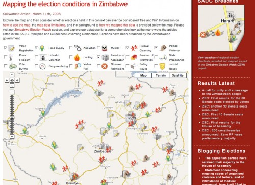
Watching Zimbabwe: Sokwanele Charts are Damning

Part of you wants to ignore it and hope it will go away. Zimbabwe is such a messed up place that it hurts to even think about it. In the midst of it all, one group is making sure that actions and events are being documented: Sokwanele.

It’s amazing how simple visuals can take a bunch of data and make it real. Above is a chart showing the mayhem, broken down by type. It’s a sick story, but one that can be told in almost real-time because of our current technology.

This is why mapping and other visualizations are so important. Sokwanele is simply collecting the news reports then archiving and parsing them for information. When those stories come in ones and twos throughout the week, it’s easier to ignore. When they’re put forward as a body of evidence using visuals to show their aggregate statistics, it becomes damning and impossible to ignore.

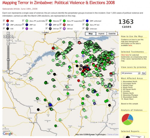
That’s a busy map above. In fact, so busy that you’ll be surprised to know that it’s just the violence that has been perpetrated since the elections at the end of March. Anyone remember the “old” map, from way back then, 3 months ago? I do, and have the screenshot below:

By the way, both of those maps only show a small sample of what is being done. Not everything is reported to news organizations or directly to Sokwanele.

Some people might ask, “But, does Sokwanele’s map help at all?” I’m guessing that it doesn’t directly. However, what it does do is proved fodder for organizations inside and out to make an even stronger case against this repressive regime.

[Note: if you can handle graphically violent images, check out Sokwanele’s Flickr stream.]

On a Personal Note
Those of us on the Ushahidi team think on this stuff a lot. We’re not off trying to win mashup competitions and raise funding for further development because we think it’s a fun startup idea. No, we’re doing this because it matters and we believe our tool will help raise awareness and empower organizations to understand and activate against wrongs.

If anything, I’m compelled more than ever to figure out how technology can continue to create change in truly screwed up places.

Mapping Xenophobic Attacks in South Africa

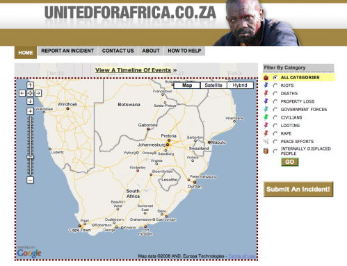
The Ushahidi engine (version 1) is being used to map reports of the current xenophobic attacks happening in South Africa on a site called UnitedforAfrica.co.za. The attacks are a product of foreigners moving across the borders, especially Zimbabwean, and encroaching on the lives of South Africans. I suggest reading this BBC article for more information.

United for Africa: Mapping reports of xenophobia in South Africa

Quirk, a web marketing agency in Cape Town is leading this charge, with Tim Shier, Rafiq and David Kobia all pulling VERY late nights last night to make this come together. Quirk will act as administrators on this build, and the Ushahidi team will step away from it as soon as the build is done.

The most important part of this type of campaign is to get the word out. SMS, email, call your friends and family all over South Africa and get them to tell their friends so that more reports come in. The more that come in, the better the tool.

A couple resources for this crisis in South Africa:

So, what’s up with this “Ushahidi engine”?
As you might/might not be aware, we’ve worked up a plan for a new version of Ushahidi (v2) that would replace what we’ve done as a free and open source tool for crowdsourcing crisis information and then visualizing that on a map. We’ll be presenting that idea next week at the NetSquared challenge in California, and are already building the basic architecture for that. This collaboration with the guys in South Africa ends up being a perfect example of the need for a rapid deployment tool like Ushahidi.

What we could use is more developers from around the world to help us. We already have a good dozen who have committed to helping in some way or other, ranging from the Bay area in California to Kenya to South Africa and Malawi. If you’d like to take part, please get in touch!

WhereCamp 2008 Rundown

I’m glad that I decided to stay the 2 extra days following Where 2.0 in order to attend WhereCamp 2008, held at Google’s offices. Frankly, I don’t think you could come up with a better venue. Dusty, Ryan and Anslem did a great job of pulling it all together. We lacked for nothing; WiFi, food, beverages, good conversations, and talks.

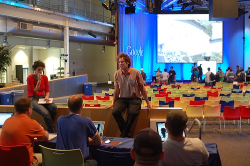
Mikel leading a discussion on time

It was a real trip to be amongst some of these true geo/mapping gurus, which led to some great discussions. A few memorable ones:

  • The 4th dimension: Time
  • Are the big map providers (Google, Yahoo, Microsoft) destroying the mapping ecosystem?
  • Using ham radio for location using APRS
  • Open Streetmap on how to get better data and simplify the user experience

Of all these discussions I was most interested in the one on “time”. It’s one of the areas that we felt made Ushahidi so much more usable, and so we’re trying to figure out ways to make it even more useful in the next iteration. Time is one of the few variables that hasn’t been well represented in map visualizations, but I think this year will see that change significantly.

And, of course, the lightning rounds were a lot of fun. Each person had 5 minutes to talk about whatever they liked. We heard about everything from geocaching games to visualizing crime via heatmaps, to NNDB’s mapper tool that allows you to map relationships between people and things.

Google Tent

Google handed out tents for all of us, so there were quite a few who camped out in the open area over night. Great way to keep people around, and a fun little item to remember the event by.

[more images on Flickr]

Activist Mapping Presentation at Where 2.0

I had the honor of closing O’Reilly’s Where 2.0 Conference today, where I gave a talk on “Activist Mapping” and some history on our Ushahidi project in Kenya. A couple people have asked me to make the slides available, so I’ve embedded the presentation below.

I’m not sure how useful those images are without the context of me speaking to them. Since I generally type out my notes, I’ve added those below after the “more” button. The notes are not verbatim what I said, but will give you a general indication of what I talked about.

More after the jump! (warning, this is long as it’s a 20 minute talk)

Continue reading

Where 2.0: Data Overload and Some Announcments

Where 2.0 has started. One series of speakers down, and much more to come. I have the distinct impression that I’m going to have some serious information overload by the end of the day…

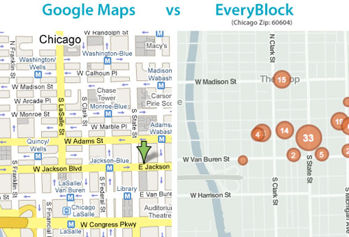
I thoroughly enjoyed Adrian Holovaty of EveryBlock’s talk. His partner Paul wrote a couple pieces on rolling your own maps recently that I loved. They’re breaking down the reliance on the mega mapping API’s (Google, Yahoo, MS) as the only way to show your geographic data. Adrian also talked about something that I often think of; using more than just points in showing map data. We need more polygons (ex: heatmaps) and lines.

comparing EveryBlock with Google Maps

Nokia’s Michael Halbherr, head of Location Based Services (LBS) did a short talk on Ovi, their platform for seemless mapping integration between mobiles and the web. He made a point of saying that Nokia is mobile/guidance centric, not web/location centric.

Finder! by GeocommonsNext up was Sean Gorman, who is doing some really interesting things with his organization(s) FortiusOne and Geocommons. His biggest thoughts/concerns were over dealing with massive data sets and the emerging semantic web. To that end he announced Finder!, which I have to admit seems pretty slick. His demo was showing how you could mashup private data sets (your company’s local sales data) with open census data, all available for download as KML, CSV or shape files. It’s slick, go sign up for the beta.

Last up was John Hanke of Google Earth, who announced two items:

  • Google Earth’s Geo Search API launching
  • GIS data relationship with ESRI in ArcGIS 9.3

John mentioned that, “maps help us organize, plan, provide context and decide.” I think that’s what has made me love maps since I was a kid, and why I’m so interested in the ability to do dynamic and real-time mapping.

For thoughts and analysis on what is happening here at Where 2.0, I’ll pass you off to some mapping gurus:

Off the Map
All Points Blog
Mapufacture Blog
Google Earth Blog
The AnyGeo Blog
High Earth Orbit
Very Spatial

Newer posts

© 2024 WhiteAfrican

Theme by Anders NorenUp ↑

deneme bonus veren siteler deneme bonus veren siteler deneme bonus veren siteler