Part of you wants to ignore it and hope it will go away. Zimbabwe is such a messed up place that it hurts to even think about it. In the midst of it all, one group is making sure that actions and events are being documented: Sokwanele.
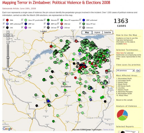
It’s amazing how simple visuals can take a bunch of data and make it real. Above is a chart showing the mayhem, broken down by type. It’s a sick story, but one that can be told in almost real-time because of our current technology.
This is why mapping and other visualizations are so important. Sokwanele is simply collecting the news reports then archiving and parsing them for information. When those stories come in ones and twos throughout the week, it’s easier to ignore. When they’re put forward as a body of evidence using visuals to show their aggregate statistics, it becomes damning and impossible to ignore.
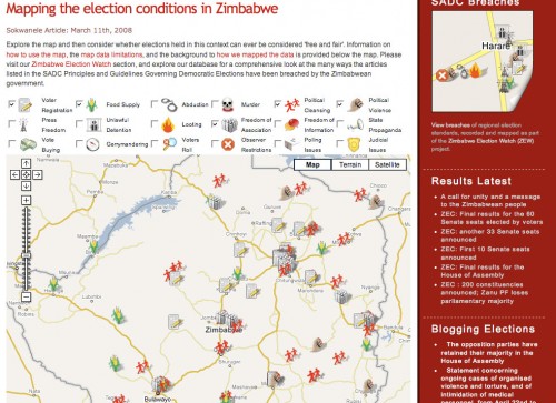
That’s a busy map above. In fact, so busy that you’ll be surprised to know that it’s just the violence that has been perpetrated since the elections at the end of March. Anyone remember the “old” map, from way back then, 3 months ago? I do, and have the screenshot below:
By the way, both of those maps only show a small sample of what is being done. Not everything is reported to news organizations or directly to Sokwanele.
Some people might ask, “But, does Sokwanele’s map help at all?” I’m guessing that it doesn’t directly. However, what it does do is proved fodder for organizations inside and out to make an even stronger case against this repressive regime.
[Note: if you can handle graphically violent images, check out Sokwanele’s Flickr stream.]
On a Personal Note
Those of us on the Ushahidi team think on this stuff a lot. We’re not off trying to win mashup competitions and raise funding for further development because we think it’s a fun startup idea. No, we’re doing this because it matters and we believe our tool will help raise awareness and empower organizations to understand and activate against wrongs.
If anything, I’m compelled more than ever to figure out how technology can continue to create change in truly screwed up places.


June 20, 2008 at 12:39 am
Thank you for presenting these charts. No one is talking about Zimbabwe here in America; it is shameful that there is so little data. I will be spreading these charts around to promote awareness of the depth of tragedy.
June 20, 2008 at 2:28 am
nothing in the charts about mental torture or promoting fear and lothing, it makes me realise that understanding is a long way off.
June 20, 2008 at 4:36 am
Hi White African
Thanks for pointing to our map. You mentioned our previous work we did and I would like to clarify that that earlier project – in relation to monitoring violations of the SADC electoral guidelines – was mapping infomation derived mainly from media sources. This obviously means we rely on the media to get their facts straight. This second map represents confirmed and verified incidents of violence recorded by a range of human rights groups. This map is infinitely more accurate and therefore more shocking.
Secondly, it has had a big impact so far so we’d encourage people to carry on with this type of work. We were advised that a major european newspaper would be using it to illustrate a story they run today, and we have had emails from journalists thanking us for helping to make the picture clearer. Our last map was featured on Sky’s 24 hour news station during the March 29th elections which meant people throughout Africa learned of the violations. It was that experience that made us realise mapping the violence would be a very good way to raise awareness.
Sassy – I don’t think it is a lack of understanding on the part of those doing the work that ‘fear’ etc isn’t recorded but more an unspoken fact that metal torture and fear and loathing among those people who have experienced the atrocities we have mapped would be at 100%.
Best
Sok.
June 20, 2008 at 4:56 am
@Sokwanele – thanks for clarifying the difference in the two maps. Of course, that makes the newer map even more disturbing.
I will email you separately about if we can help at all.
Our prayers are with you.
June 20, 2008 at 5:43 am
Hey
Thanks for sharing. I’ve passed on the linky love and shared it with my google contacts.