The Atlantic just wrote this emotional piece predicting Twitter’s demise (don’t worry, apparently they write a lot of “end of” stories). Personally, I believe Mark Twain’s misquote fits perfectly here, “The reports of my death are greatly exaggerated.”

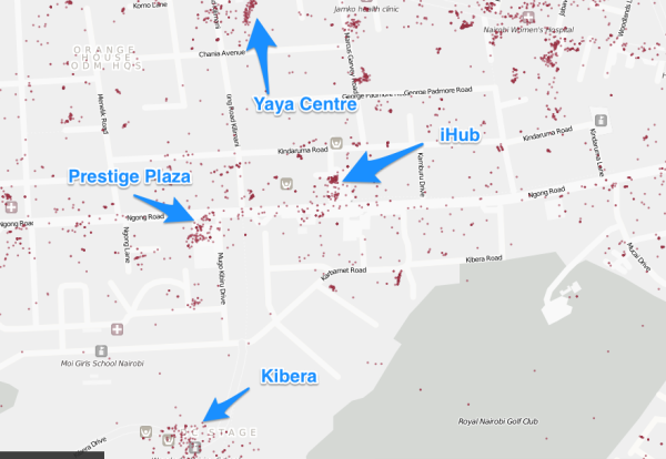
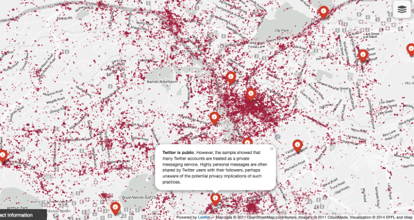
My friend Jonathan Ledgerd just sent me some links to the work that he and his colleagues have been doing at EPFL’s Afrotech Future Africa Initiative (Afrotech-EPFL) in Switzerland. They took all the geolocated tweets from Nairobi over a 3-month period near the end of 2013, with a total of 200,000 tweets in the data set.
The first of several such Twitter maps for African cities is Nairobi, you can find it here: http://twitter.lab.idiap.ch/
(Click on the top right icon to display and keep zooming in – at maximum granularity you can see exactly where the animals hang out in Nairobi National Park based on geolocated Twitter traffic.)

Twitter use in Nairobi. 200k tweets over a 3 month period in 2013
A few of Jonathan’s findings:
Tweeting does not mean production
More tweets are sent from Nairobi’s golf courses than from its factories. The industrial area of Nairobi, along Enterprise Road, produces some 8% of Kenya’s GDP, but sends sends fewer tweets than are sent from the fairways of the nearby Kenya Railway Golf Club.
Twitter is not yet embedded in the state.
Police, army and air force hardly use Twitter at all. The Kenyan army barracks on Langata Road is home to several thousand of the country’s infantry and elite commandos. It posts almost no Tweets, compared to the dense Twitter traffic produced on the road itself and in the new housing estate opposite the entrance to the barracks. Similarly, the Kenyan air force base in Eastleigh does not Tweet. By contrast, the mostly ethnic Somali community living along the edge of the base are active tweeters. More data is required to determine if government ministries reflect the pattern of the city’s military bases. If so, there may be implications for a state moving on an information cycle which is slower and less precise than that used by younger Kenyans in the private sector.
Twitter is still in English language
81% of recorded tweets were in English according to an automatic language detection system. Only 5% were in Kiswahili. The rest were in an array of other languages including Hindi, Kikuyu, Somali, Luo, the Sheng dialect, and other languages. Many of these were mixed with English. This contrasts with the wider use of Kenyan tribal languages on Facebook and in text messaging. The use of English is uniform even in the lower income dormitory towns such as Wajere and Rongai. More research is needed, but the brevity allowed to tweets as well as the common platform might force the use of English.
But Twitter is becoming more pervasive
The first tweet in Kenya was probably the one sent by the co-founder of Twitter, Evan Williams, from the lounge of the Mount Kenya Safari Club on August 11, 2007. There are now 250,000+ active Twitter accounts in Nairobi – 6 Twitter accounts per 100 Nairobians, against estimated mobile phone density of 80 mobiles per 100 Nairobians.
There are a lot more observations than this, which you can find on the map if you toggle the control on the upper-right.
May 1, 2014 at 9:48 am
Most tweets are not geotagged – 80% by this study (https://pressroom.usc.edu/twitter-and-privacy-nearly-one-in-five-tweets-divulge-user-location-through-geotagging-or-metadata/). I don’t know if you can really use this data and extrapolate the above findings aside from the language stuff – the skew is definitely towards smart phones using apps and away from browser-based tweeting.
May 1, 2014 at 11:43 am
Hey Adam, really need Jonathan or someone on his team to weigh in on the statistical relevance of their sample data. I’ll try to get him over here to say something.
May 2, 2014 at 6:11 am
Thanks Adam and Erik for your comments. I’m one of team members behind this visualization.
It is known that Twitter users are not a fair sample of the whole population in any given city, but a sample with socio-economical and self-selection biases (young, affluent, tech-savvy, etc.) It is also known that a significant population do not use or have no access to social media channels like Twitter.
In addition to the above biases, we have two additional levels of bias introduced while collecting the data:
1. Twitter’s public API does not provide all tweets. It only provides access to at most 1% of all tweets via its public streaming API [1].
2. To collect all tweets from a spatial region using the public API, we define a geographic boundary (e.g. the city of Nairobi). Therefore, by design we only collect geo-tagged tweets, which are a sample of all tweets sent from a the specified region.
We are aware of these biases, and other researchers have started investigating them. For instance, the authors in [2] performed a statistical comparison of data obtained via the streaming API with the entire data stream of Twitter. This sort of analysis is restricted to those who have access to the entire Twitter data feed (e.g. by working with Twitter or paying for the data). So for the moment we are limited to what Twitter offers for free.
This said, we believe that the data still offers valuable information, and we are exploring this in the context of African cities, starting with Nairobi. The visualization itself is useful to create a dialogue (of which this post is an example) and we hope others find it interesting to browse the visualization as we add features in the future. Besides this community use, our current work includes characterizing active contributors of geo-tagged tweets, popular urban areas among these users, and urban “gaps” related to the socio-economic factors mentioned above, through a combination of methods.
Finally, to give you some context on the data we have today, as of April 2014, we have collected 680,000 geo-tagged tweets from 20,000 users. Let me remind you that the visualization was created with only 3 months worth of data, involving roughly 200,000 geo-tagged tweets.
[1] https://dev.twitter.com/docs/faq#6861
[2] Is the Sample Good Enough? Comparing Data from Twitter Streaming API with Twitter Firehose, ICWSM 2013 — http://www.public.asu.edu/~fmorstat/paperpdfs/icwsm2013.pdf
May 2, 2014 at 6:32 am
Darshan, thanks for clarifying the numbers behind it. Looking forward to what you do next as you get more data and as more cities show up in your work.