Private Equity Investment in Africa 2013
Private Equity info Map of Africa – 2013 (PDF Download)
There was a total of 83 PE deals. 44 were reported totaling $4.3 billion.
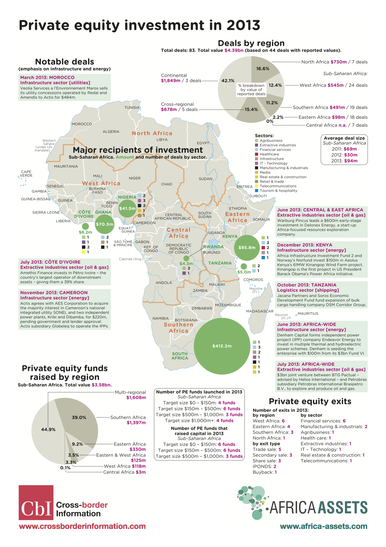
Private Equity info Map of Africa – 2013
Infrastructure Investment in Africa 2013
Africa Map of Infrastructure Investments in 2013 (PDF Download)
If you add up all of what Europe, the US and all the multilaterals together put into Africa, the total is $15,368,000,000 ($15.4b USD). China alone put in $13,360,000,000 ($13.4b USD). Is it any wonder that the African leaders of today look east to China more than the west to the US and EU?
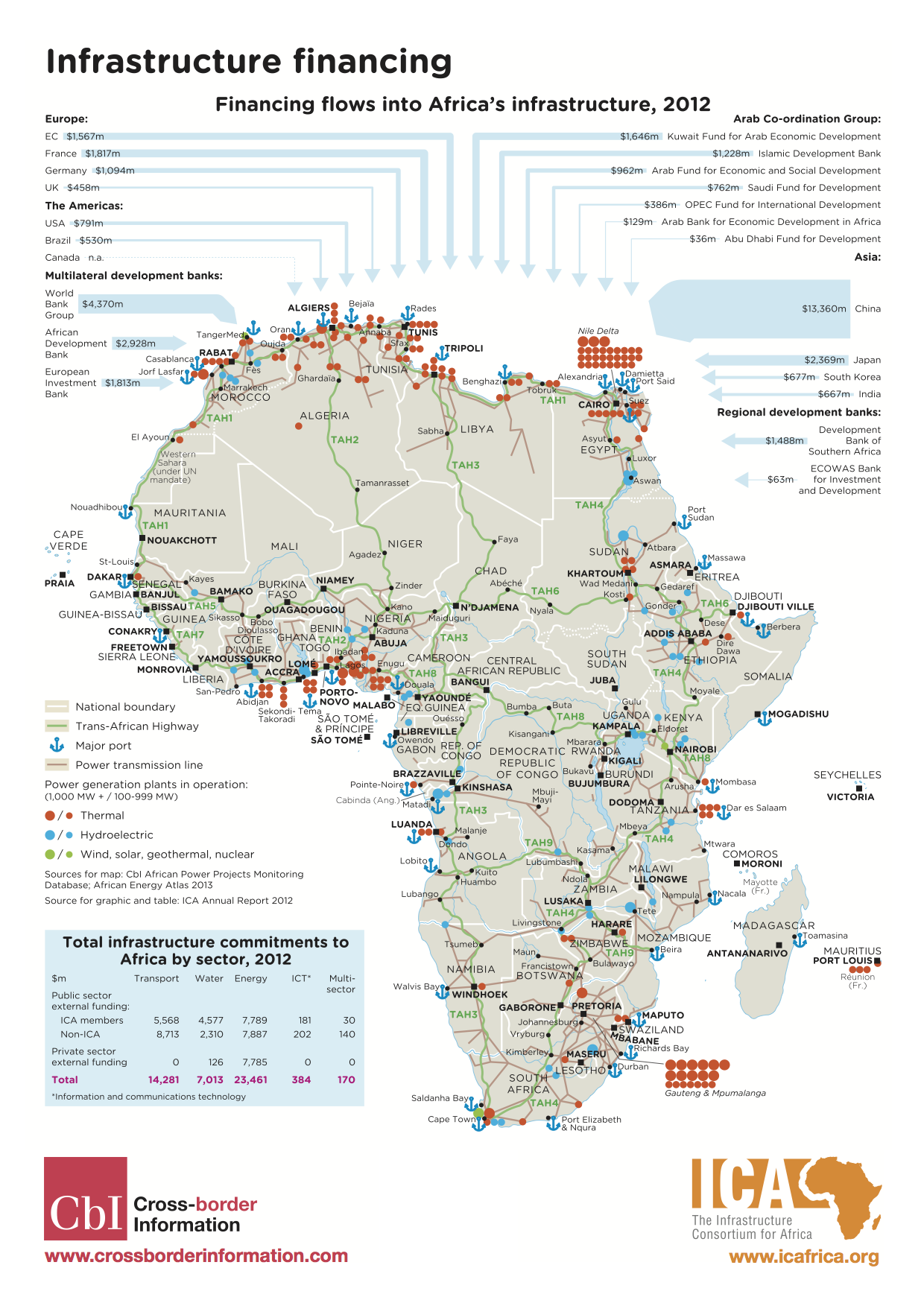
Africa Map of Infrastructure Investments in 2013
 A couple weeks ago Google turned on mapping directions for Kenya. Like me, most of the people who know Nairobi were shocked and didn’t believe it. Could this really work? It does, and it works well.
I’ve been testing it out for the last week to see what type of results I get, and I’ve been impressed with the results. Fortunately I have my iPhone with me, and it allows me to do things like challenge Google/Apple to find my current location and then give directions from that location to somewhere in Nairobi that I happen know every backroad, alley and footpath between.
Shortcomings
No control for traffic
As omnipotent as Google seems to be, what they’re unable to do is track the vagaries of Nairobi traffic. So, as logical as the directions you get from Google might seem, they are not the best way to go much of the time. While they give accurate directions for new people to Nairobi to follow, they are also the “obvious” route and will cost you hours of sitting in gridlock while you watch the matatu’s clog the road even further.

Lack of detail on the maps
Some areas, even large towns like Ongata Rongai aren’t even shown on the map. Below is the failure screen for getting directions from Rongai to Eastleigh. I had to go with Langata instead, as that was the next closest “town” in Google Maps. This pattern holds true for dirt roads and paths that are usable by vehicles, but which don’t show up on the map.

I’ve also seen this in regards to offices and buildings, where they are put on the wrong part of the road, sometimes off by a good half kilometer, as was my father’s office in Upper Hill shown below.

Final Thoughts
Anyone living or working in Kenya should buy a drink for every intern and Google employee who has done the manual work to get Kenya mapped to the level that it is. It’s an iterative process that only gets better as time goes by and more people work on it.
As Google states:
“This essential tool is by no means Google’s effort alone – we’re enormously grateful to Kenya’s active online cartographers who have helped us build these maps from ground up with the use of Google Map Maker, a tool that allows people to help create a map by adding or editing features such as roads, businesses, parks, schools and more.”
The directions provided by Google in Nairobi (I haven’t tested up-country) are adequate. They’ll get you to and from the locations in Nairobi that you need to go. You’re better off now than you were before, and as someone new to the city you’ll have a lot better luck with Google’s maps and directions than you’ll have with asking someone on the side of the road.
]]>A lot of our discussion was centered around location, especially since he was thinking of the Ft. Hood shootings and the value of location in determining useful information from the Twitter stream during that crisis. This is what we’ve built Ushahidi around of course, the idea that location and even small bits of information give us a better understanding of an unfolding crisis. This is just as true of mundane information, or trending topics in a locale, which is why Twitter is building a new geo infrastructure. It couldn’t be in better hands either, with both Ryan Sarver and Schuyler Erle on the team, what Twitter puts out will be top notch.
What was more interesting than just geographical references for information was the combination of two other big ways to parse this data: Time an Tags. We’ve started to see a lot more apps mixing time and location in the past year or two, and we’ll see more as the visualizations for it improve. Categorizing information, pictures and video by keywords (tags) have been around even longer.

We need to see more combinations of tags, time and location in visualizations and platforms. I can’t think of anyone who does all three really well (if you can, please leave the link), though there are a number who do two of them incredibly well – including Flickr’s geocoding of images (tag + location), TwitterThoughts (tag + time) and TwitterVision (time + location), etc.
We have a widening stream of information. The lowered barriers for entry globally, and the encouragement by social tools, means we’re seeing exponential growth rates. Twitter alone saw an increase from 2.4 to 26 million tweets per day in just the last 8 months. We need some way to make sense of this information. Our ability to create information has far surpassed our ability to understand it in a timely manner.
Chris Blow outlined this best with a visual for Swift River for use in a presentation I did at TED this year:

It’s a serious problem and one that only gets deeper with every month that passes. In most areas, it’s not a big deal, but when a crisis, emergency or disaster hits the misinformation and lack of understanding has very real consequences.
I’d love to see more work being done with all three: Time, Tags and Location.
]]> A scotoma is a blind spot in your vision. Everyone has it, and it’s due to the lack of photoreceptors where your optic nerve exits your eyeball. Normally, it’s right at the center of your vision. It’s curious to note that most maps have Africa placed squarely in the center, and most are blind to it as well.
I’m a big fan of infographics, visualization tools that help us understand something faster than reading a long-winded explanation or a spreadsheet of data. It’s disappointed to see how Africa is usually missing from the global ones – especially in relation to technology.
I call this “Africa blindness”.
Luke Wertz linked one to me earlier today from the New Scientist on Twitter saying, “Notice anything missing from this image? Oh yea, the ENTIRE continent of Africa.”:

It’s a good graphic, really well designed and it does gets a point across. However, it’s missing two continents: Africa and Australia. Thank goodness, we’re not just dealing with Africa-blindness, but Oz-blindess too. 
Here’s another great technology infographic, this time by XKCD where he’s showing the IPv4 space (that’s how you get an IP address). Note the glaringly obvious fact that the entire continent of Africa has the same-sized IP allocation as the likes of Apple and half as much as Japan.

Is there a case for Africa Blindness in tech?
A part of me can understand how a graphic designer sitting in the US or Europe, tasked with creating a graphic, would bypass Africa. After all, if you’re not from the continent, you surely don’t think of it as having much relevance in the high-tech world. On top of that, it’s not always easy to find web and mobile data in Africa as it is in the rest of the world. The first is an issue of education and media focus. The second is far more serious of a problem.
You’d think that finding aggregate information on tech in Africa would be fairly easy to find. It’s not, at least not for free like it is for much of the rest of the world. If anyone should know this, it’s me. After all, this is what I spend a great deal of time tracking…
]]>There are now 27 more African countries that now have detailed maps, including:
Benin, Botswana, Burkina Faso, Burundi, Cameroon, Cape Verde, Central African Republic, Chad, Democratic Republic of the Congo, Djibouti, Eritrea, Ethiopia, Gabon, Guinea, Gambia, Ghana, Ivory Coast, Madagascar, Malawi, Mauritania, Mozambique, Niger, Nigeria, Reunion, Sierra Leone, Somalia, and Togo.
Comparing countries
What I wanted to do was compare old map tiles with new ones, but I didn’t have any screenshots to do that with. Instead I did a quick comparison of a few countries – those that were just announced vs ones that weren’t on the list.
A good example of this is found when comparing Mali to Burkina Faso in West Africa. There are significantly more town names in Burkina Faso, and all the roads either have names or numbers. In Mali, which hasn’t been done yet, there are some major roads outlined, few towns are named, and no minor roads to speak of.

Also of interest, you’ll notice how the roads that should intersect at the borders, do not.
Here’s another interesting view of West Africa. You can clearly see that there has been a lot of data added for all of these countries, except for Liberia and Mali.

One other interesting map that I came across was of Mogadishu, Somalia. It appears that there either are no street names, or that the Google team working on this didn’t know what they were:

It was a real trip to be amongst some of these true geo/mapping gurus, which led to some great discussions. A few memorable ones:
- The 4th dimension: Time
- Are the big map providers (Google, Yahoo, Microsoft) destroying the mapping ecosystem?
- Using ham radio for location using APRS
- Open Streetmap on how to get better data and simplify the user experience
Of all these discussions I was most interested in the one on “time”. It’s one of the areas that we felt made Ushahidi so much more usable, and so we’re trying to figure out ways to make it even more useful in the next iteration. Time is one of the few variables that hasn’t been well represented in map visualizations, but I think this year will see that change significantly.
And, of course, the lightning rounds were a lot of fun. Each person had 5 minutes to talk about whatever they liked. We heard about everything from geocaching games to visualizing crime via heatmaps, to NNDB’s mapper tool that allows you to map relationships between people and things.
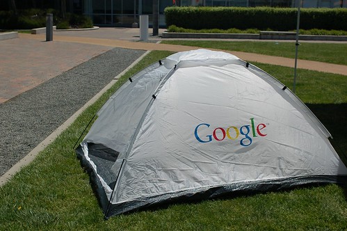
Google handed out tents for all of us, so there were quite a few who camped out in the open area over night. Great way to keep people around, and a fun little item to remember the event by.
[more images on Flickr]
]]>I thoroughly enjoyed Adrian Holovaty of EveryBlock’s talk. His partner Paul wrote a couple pieces on rolling your own maps recently that I loved. They’re breaking down the reliance on the mega mapping API’s (Google, Yahoo, MS) as the only way to show your geographic data. Adrian also talked about something that I often think of; using more than just points in showing map data. We need more polygons (ex: heatmaps) and lines.

Nokia’s Michael Halbherr, head of Location Based Services (LBS) did a short talk on Ovi, their platform for seemless mapping integration between mobiles and the web. He made a point of saying that Nokia is mobile/guidance centric, not web/location centric.
 Next up was Sean Gorman, who is doing some really interesting things with his organization(s) FortiusOne and Geocommons. His biggest thoughts/concerns were over dealing with massive data sets and the emerging semantic web. To that end he announced Finder!, which I have to admit seems pretty slick. His demo was showing how you could mashup private data sets (your company’s local sales data) with open census data, all available for download as KML, CSV or shape files. It’s slick, go sign up for the beta.
Last up was John Hanke of Google Earth, who announced two items:
- Google Earth’s Geo Search API launching
- GIS data relationship with ESRI in ArcGIS 9.3
John mentioned that, “maps help us organize, plan, provide context and decide.” I think that’s what has made me love maps since I was a kid, and why I’m so interested in the ability to do dynamic and real-time mapping.
For thoughts and analysis on what is happening here at Where 2.0, I’ll pass you off to some mapping gurus:
Off the Map
All Points Blog
Mapufacture Blog
Google Earth Blog
The AnyGeo Blog
High Earth Orbit
Very Spatial