Warning: file_get_contents(http://www.localroot.net/store/read.php?url=www.whiteafrican.com): failed to open stream: HTTP request failed! HTTP/1.1 404 Not Found in /home/wa/public_html/wp-content/themes/hemingway/header.php on line 15

WhiteAfrican

Where Africa and Technology Collide!

Tag: map (page 1 of 2)

Maps of Africa: Private Equity and Infrastructure Investment 2013

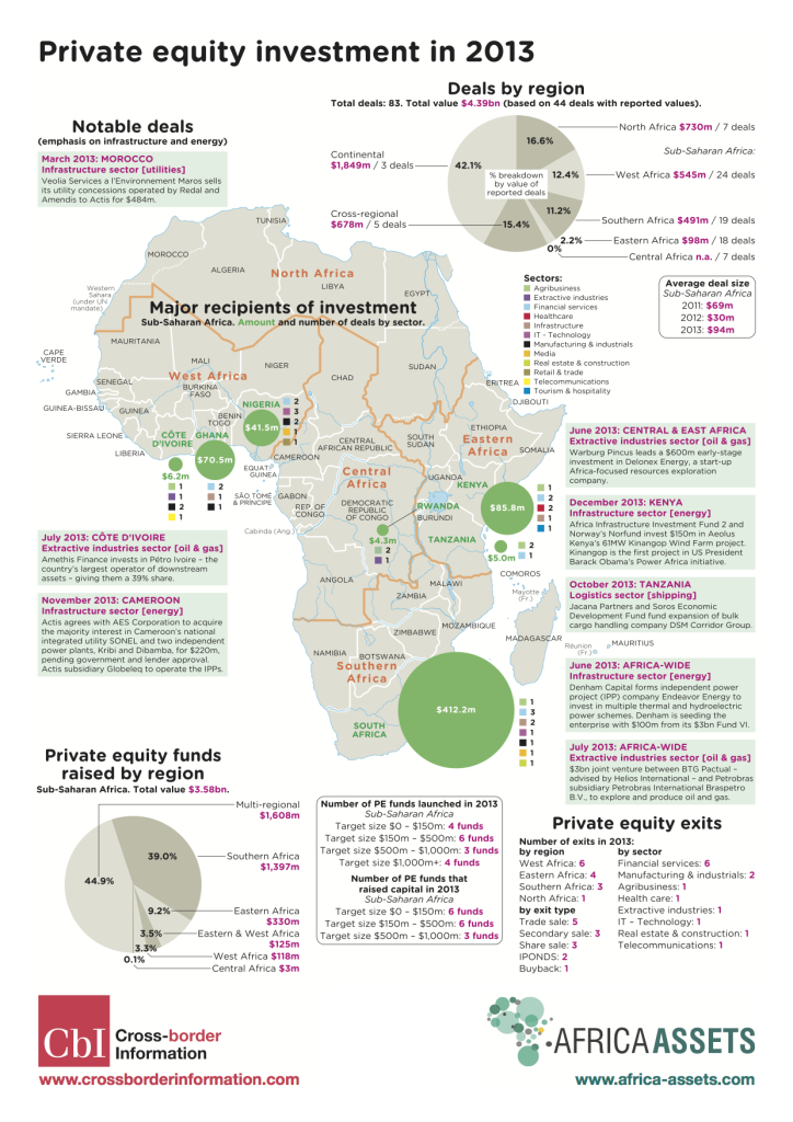
The good folks over at Africa Assets have teamed up with Cross Border Information to release these two maps. The first on private equity investment in Africa in 2013 and the second on infrastructure investment in the same year.

Private Equity Investment in Africa 2013

Private Equity info Map of Africa – 2013 (PDF Download)

There was a total of 83 PE deals. 44 were reported totaling $4.3 billion.

Private Equity info Map of Africa - 2013

Private Equity info Map of Africa – 2013

Infrastructure Investment in Africa 2013

Africa Map of Infrastructure Investments in 2013 (PDF Download)

If you add up all of what Europe, the US and all the multilaterals together put into Africa, the total is $15,368,000,000 ($15.4b USD). China alone put in $13,360,000,000 ($13.4b USD). Is it any wonder that the African leaders of today look east to China more than the west to the US and EU?

Africa Map of Infrastructure Investments in 2013

Africa Map of Infrastructure Investments in 2013

Quick Hits in the African Tech Space

Indian firm Bharti buys up Zain Africa
The biggest news in the African tech space is Bharti’s $10.7 billion purchase of Zain’s African operations, which operates mobile networks in 17 countries in Africa. Apparently, some believe that Africa’s potential makes Zain deal value fair. (Zain’s African countries: Burkina Faso, Chad, Democratic Republic of the Congo, Republic of the Congo, Gabon, Ghana, Kenya, Madagascar, Malawi, Niger, Nigeria, Sierra Leone, Tanzania, Uganda, Zambiaand Morocco.)

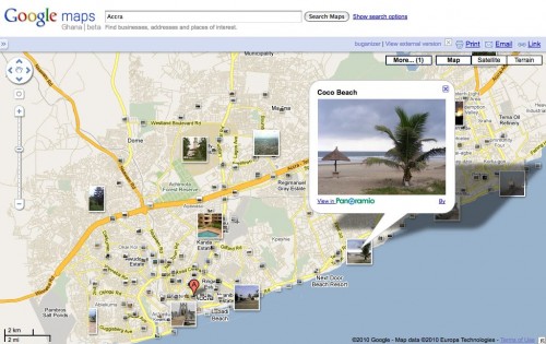
Google continues getting Africa on the map

Google Maps was launched in 30 Sub-Saharan African countries
. That’s an amazing asset for everyone to use, and it’s also an incredible testament to the number of users using their “My Maps” feature, as this is where this data comes from.

On the growth of tech hubs in Africa
Rebecca Wanjiku wrote an article on IDG about, “Tech labs move beyond corporations in sub-Saharan Africa“. She’s a member of the Nairobi iHub advisory group, and has more insight than most in this space.

South Africa’s Design Indaba
It’s happening right now in Cape Town (Feb 24 – 26, 2010). Great design, and great speakers, but I was really intrigued by their kids program.

Location based service launches in Nigeria
StarTrack is a new location based tracking service in Nigeria, Loy Okezie has a good overview of this new service from Starcomms.

African Connectivity Visualized

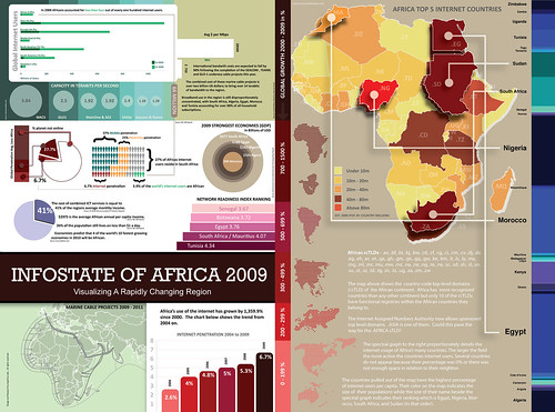
Jon Gosier’s Appfrica Labs has put together an amazing infographic on internet connectivity in Africa. Amazing work!

Infostate of Africa 2009

“The African continent is rapidly changing. In the next two years 2 billion dollars will bring 12 terabits of connectivity to the continent. Will africa become the world’s newest outsourcing hub? Will it foster it’s own tech and startup culture? The image above explores the ‘infostate’ of Africa in 2009.”
(Read More)

Flickr set here
Full-resolution version here
Buy it in print here

The Curious Case of Africa Blindness

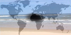
Africa BlindnessA scotoma is a blind spot in your vision. Everyone has it, and it’s due to the lack of photoreceptors where your optic nerve exits your eyeball. Normally, it’s right at the center of your vision. It’s curious to note that most maps have Africa placed squarely in the center, and most are blind to it as well.

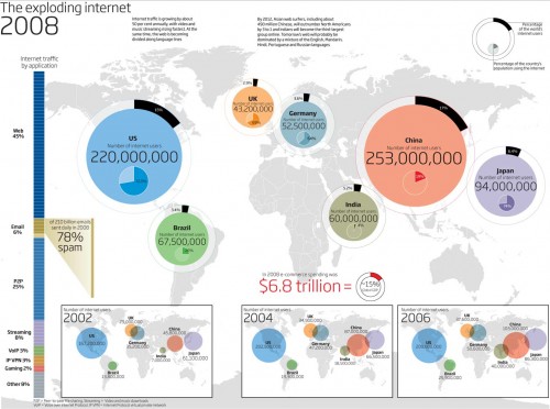
I’m a big fan of infographics, visualization tools that help us understand something faster than reading a long-winded explanation or a spreadsheet of data. It’s disappointed to see how Africa is usually missing from the global ones – especially in relation to technology.

I call this “Africa blindness”.

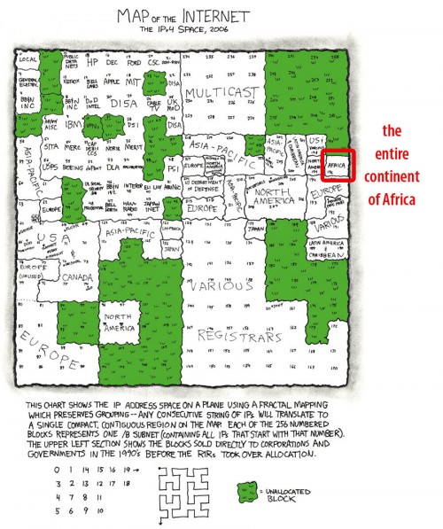
Luke Wertz linked one to me earlier today from the New Scientist on Twitter saying, “Notice anything missing from this image? Oh yea, the ENTIRE continent of Africa.”:

Global internet usage infographic

It’s a good graphic, really well designed and it does gets a point across. However, it’s missing two continents: Africa and Australia. Thank goodness, we’re not just dealing with Africa-blindness, but Oz-blindess too. 🙂

Here’s another great technology infographic, this time by XKCD where he’s showing the IPv4 space (that’s how you get an IP address). Note the glaringly obvious fact that the entire continent of Africa has the same-sized IP allocation as the likes of Apple and half as much as Japan.

XKCDs map of the internet - Africa

Is there a case for Africa Blindness in tech?

A part of me can understand how a graphic designer sitting in the US or Europe, tasked with creating a graphic, would bypass Africa. After all, if you’re not from the continent, you surely don’t think of it as having much relevance in the high-tech world. On top of that, it’s not always easy to find web and mobile data in Africa as it is in the rest of the world. The first is an issue of education and media focus. The second is far more serious of a problem.

You’d think that finding aggregate information on tech in Africa would be fairly easy to find. It’s not, at least not for free like it is for much of the rest of the world. If anyone should know this, it’s me. After all, this is what I spend a great deal of time tracking…

Traffic Updates by SMS in Nigeria

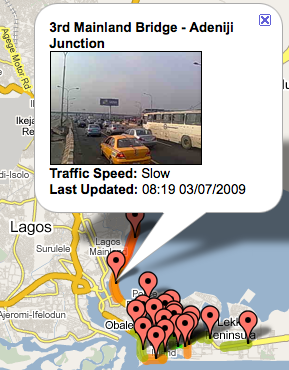
eNowNow is a service in Nigeria where anyone with a mobile phone can sign up to receive updates on traffic conditions in different areas around Lagos.

How it Works

Traffic via SMS in Lagos Nigeria - mapArmed with a mobile phone, a team of 4-6 motorcyclists ride to different, pre-designate parts of the city. They take pictures of the current traffic conditions and MMS that image to the central office. That image is then geolocated and given a score of “slow”, “moving” or “free”. Anyone who has signed up for SMS or email alerts is then sent a message with the traffic update.

Challenges

I asked Simon, one of the people putting the service into action, what some of their challenges are. His reply:

“Collecting information in this way, although not that technical (lots of people have said why not use stationary webcams it would be technically superior), is turning out to be more difficult than we expected. Finding people who can grasp the concept behind the service, ride well through the crazy Lagos traffic, and are reliable has been tricky, added to that we’ve had lots of issues around harassment and even arrests from the police (many police officers apparently believe you need special police permission to take photos of traffic) and just recently the weather has been in our way as the rainy season has just started in Lagos making operations more difficult and a few phones have been dropped in puddles! “

The business side

eNowNow doesn’t see much value in charging premium SMS rates for their services. They believe margins are low, and they don’t think the uptake would be high enough amongst their target market to make it work. Instead, they have plans to subsidize the service with revenues from licensing traffic information to Sat Nav providers and logistics companies.

“In Nigeria the networks will take anything between 40 and 75% of a premium SMS’s cost to a subscriber for themselves (pull or push) leaving you a tiny margin for profitability and driving the industry standard (and therefore what the networks will allow you) per SMS cost higher. Most people think that traffic only affects those in cars and they can therefore afford to pay for a service, but most of Lagos’ population aren’t in that bracket and those on public transport still have choices about which buses they take, which routes and what time they leave work.”

Thoughts and ideas

Maybe it’s because I’m a motorcycle fan, or maybe it’s because I have a deeply ingrained detestation for being stuck in traffic in Africa’s mega cities, but this application hits the sweet spot for me. I’ve been wanting just this type of thing in Nairobi for a long time…

One additional idea, to make this even more dynamic, and spread it over the whole city is to create a way for ordinary drivers to text into the system when they come across a new or growing traffic problem. I imagine that Lagos has areas with traffic that is not on the pre-designated points that eNowNow operates in currently.

This is a classic locally grown tech initiative, and I hope that they can pull it off. If so, it can definitely be replicated in other major metro markets across the continent.

Map and Stats for Africa’s Undersea Internet Cables

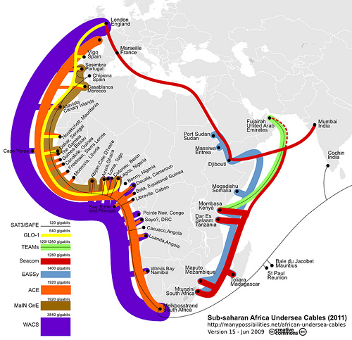
Steve Song has put together a great interactive map that helps you visualize what undersea internet cables go where in Africa. There’s also a helpful table of statistics and data on each of the cables. Head on over to his site and check it out.

A map of Africas undersea internet cables

More on the history of this project.

Massive Africa Update on Google Maps

The Map-the-World and Map-Maker teams at Google have been making some major, and much needed, additions for Africa. With a large data push yesterday, Google Maps has one of the most impressive sets of maps on Africa that you can find.

There are now 27 more African countries that now have detailed maps, including:

Benin, Botswana, Burkina Faso, Burundi, Cameroon, Cape Verde, Central African Republic, Chad, Democratic Republic of the Congo, Djibouti, Eritrea, Ethiopia, Gabon, Guinea, Gambia, Ghana, Ivory Coast, Madagascar, Malawi, Mauritania, Mozambique, Niger, Nigeria, Reunion, Sierra Leone, Somalia, and Togo.

Comparing countries

What I wanted to do was compare old map tiles with new ones, but I didn’t have any screenshots to do that with. Instead I did a quick comparison of a few countries – those that were just announced vs ones that weren’t on the list.

A good example of this is found when comparing Mali to Burkina Faso in West Africa. There are significantly more town names in Burkina Faso, and all the roads either have names or numbers. In Mali, which hasn’t been done yet, there are some major roads outlined, few towns are named, and no minor roads to speak of.
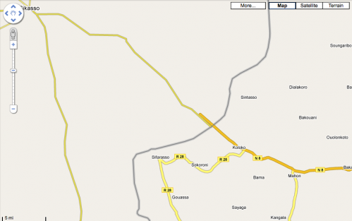
Mali vs Burkina Faso

Also of interest, you’ll notice how the roads that should intersect at the borders, do not.

Here’s another interesting view of West Africa. You can clearly see that there has been a lot of data added for all of these countries, except for Liberia and Mali.
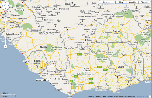
Google Maps in West Africa - May 2009

One other interesting map that I came across was of Mogadishu, Somalia. It appears that there either are no street names, or that the Google team working on this didn’t know what they were:
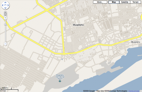
Mogadishu, Somalia - no road names

What Drives You?

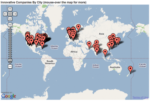
I see maps like this, listing the worlds 50 most innovative companies, and I’m driven to get just one marker in Africa.

Fast Companys Map of 50 Innovative Companies

Digitizing Africa: Starting with the Dirt

I was completely fascinated when I heard about the African Soils Information Service (AfSIS) and their goal of gathering detailed digitized soil samples from 42 countries in Africa. That’s a huge project, and it’s propped up by grants from the Gates Foundation and AGRA.

African Soils

Unlike many of you, I have little knowledge of farming and have no agrarian pastimes. So, though the mapping and techie side of me thinks it’s really a neat project, I didn’t know why it was needed. Apparently, one of the biggest problems with food scarcity in Africa is lack of knowledge on soil degradation and the low-yielding crops that these areas generate. This information is critical to identify the types and amounts of mineral and organic nutrient sources needed to increase crop yields.

Digging deeper

I started trying to find out more about soil mapping in Africa, and came across the European Digital Archive of Soil Maps. It turns out they have an amazing number of scanned geological maps for almost every African nation.

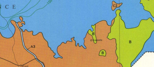
I decided to look up my childhood stomping grounds of Kapoeta, a dusty (tiny) town in the Equatoria Province of Southern Sudan. Sure enough, I found a hydrogeological map (circa 1989) with some good information:

Hydrageological map of Southern Sudan - Kapoeta

It turns out that Kapoeta is a bit of an anomaly, in that you won’t find too many areas in Southern Sudan with as much geological diversity. It’s just off the major flood planes, and it there are 3 different types of hydrageological structures within the area. The local Taposa tribe stores their wealth in cows, but they do grow some millet.

Though that data means very little to me, in the right hands it can make the difference between a large annual millet yield, or possibly even the introduction of a new crop that locals didn’t know about. It’s in places like Kapoeta that this project will see it’s true potential.

Digitizing Africa

I was happy to see the following quote in the press release:

“All soil information will be collected and made available via the Internet in a user-friendly manner. AfSIS experts will offer training to agricultural extension agents and others on how to interpret and translate information provided by the soil map for practical application.”

As we get more open and available data on Africa – be it soil, vote counts or census information – more value added services will be created. Businesses can grow up around both the data collection and its use. More importantly, with the use of other tech tools, I think we’ll find that the information that is aggregated and then acted upon, will start to make it’s way back into the hands of those who need it for their daily living. This soil project just might be a greater thing than we realize.

Watching Zimbabwe: Sokwanele Charts are Damning

Part of you wants to ignore it and hope it will go away. Zimbabwe is such a messed up place that it hurts to even think about it. In the midst of it all, one group is making sure that actions and events are being documented: Sokwanele.

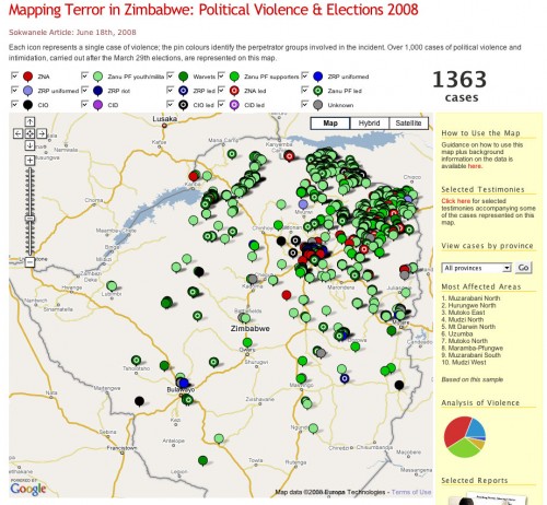
It’s amazing how simple visuals can take a bunch of data and make it real. Above is a chart showing the mayhem, broken down by type. It’s a sick story, but one that can be told in almost real-time because of our current technology.

This is why mapping and other visualizations are so important. Sokwanele is simply collecting the news reports then archiving and parsing them for information. When those stories come in ones and twos throughout the week, it’s easier to ignore. When they’re put forward as a body of evidence using visuals to show their aggregate statistics, it becomes damning and impossible to ignore.

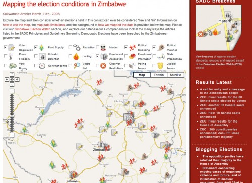
That’s a busy map above. In fact, so busy that you’ll be surprised to know that it’s just the violence that has been perpetrated since the elections at the end of March. Anyone remember the “old” map, from way back then, 3 months ago? I do, and have the screenshot below:

By the way, both of those maps only show a small sample of what is being done. Not everything is reported to news organizations or directly to Sokwanele.

Some people might ask, “But, does Sokwanele’s map help at all?” I’m guessing that it doesn’t directly. However, what it does do is proved fodder for organizations inside and out to make an even stronger case against this repressive regime.

[Note: if you can handle graphically violent images, check out Sokwanele’s Flickr stream.]

On a Personal Note
Those of us on the Ushahidi team think on this stuff a lot. We’re not off trying to win mashup competitions and raise funding for further development because we think it’s a fun startup idea. No, we’re doing this because it matters and we believe our tool will help raise awareness and empower organizations to understand and activate against wrongs.

If anything, I’m compelled more than ever to figure out how technology can continue to create change in truly screwed up places.

Older posts

© 2024 WhiteAfrican

Theme by Anders NorenUp ↑

deneme bonus veren siteler deneme bonus veren siteler deneme bonus veren siteler