The good folks over at Africa Assets have teamed up with Cross Border Information to release these two maps. The first on private equity investment in Africa in 2013 and the second on infrastructure investment in the same year.
Private Equity Investment in Africa 2013
Private Equity info Map of Africa – 2013 (PDF Download)
There was a total of 83 PE deals. 44 were reported totaling $4.3 billion.
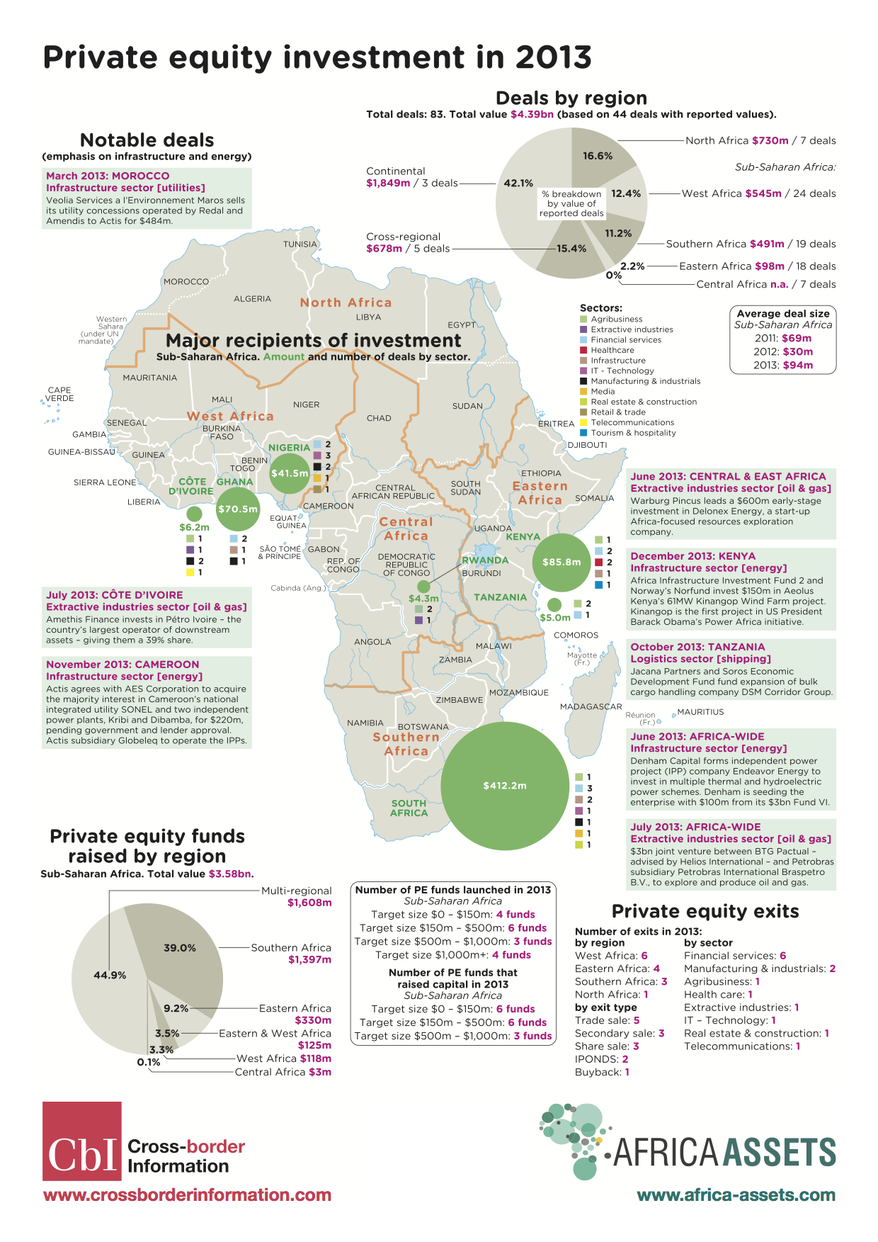
Private Equity info Map of Africa – 2013
Infrastructure Investment in Africa 2013
Africa Map of Infrastructure Investments in 2013 (PDF Download)
If you add up all of what Europe, the US and all the multilaterals together put into Africa, the total is $15,368,000,000 ($15.4b USD). China alone put in $13,360,000,000 ($13.4b USD). Is it any wonder that the African leaders of today look east to China more than the west to the US and EU?
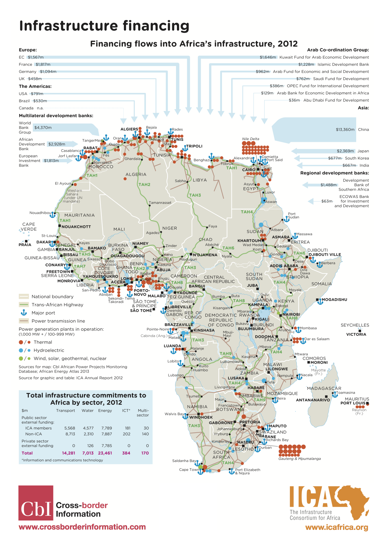
Africa Map of Infrastructure Investments in 2013
 A couple weeks ago Google


 Next up was Sean Gorman, who is doing some really interesting things with his organization(s)