On Friday I had a long conversation with Noam Cohen from the New York Times about Ushahidi and Twitter. He was doing some homework for an article he was writing on the increased value that geolocation data can add to the massive streams of data coming out of tools like Twitter, called “Refining the Twitter Explosion with GPS“.
A lot of our discussion was centered around location, especially since he was thinking of the Ft. Hood shootings and the value of location in determining useful information from the Twitter stream during that crisis. This is what we’ve built Ushahidi around of course, the idea that location and even small bits of information give us a better understanding of an unfolding crisis. This is just as true of mundane information, or trending topics in a locale, which is why Twitter is building a new geo infrastructure. It couldn’t be in better hands either, with both Ryan Sarver and Schuyler Erle on the team, what Twitter puts out will be top notch.
What was more interesting than just geographical references for information was the combination of two other big ways to parse this data: Time an Tags. We’ve started to see a lot more apps mixing time and location in the past year or two, and we’ll see more as the visualizations for it improve. Categorizing information, pictures and video by keywords (tags) have been around even longer.

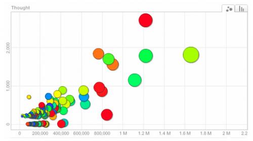
We need to see more combinations of tags, time and location in visualizations and platforms. I can’t think of anyone who does all three really well (if you can, please leave the link), though there are a number who do two of them incredibly well – including Flickr’s geocoding of images (tag + location), TwitterThoughts (tag + time) and TwitterVision (time + location), etc.
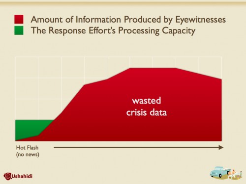
We have a widening stream of information. The lowered barriers for entry globally, and the encouragement by social tools, means we’re seeing exponential growth rates. Twitter alone saw an increase from 2.4 to 26 million tweets per day in just the last 8 months. We need some way to make sense of this information. Our ability to create information has far surpassed our ability to understand it in a timely manner.
Chris Blow outlined this best with a visual for Swift River for use in a presentation I did at TED this year:
It’s a serious problem and one that only gets deeper with every month that passes. In most areas, it’s not a big deal, but when a crisis, emergency or disaster hits the misinformation and lack of understanding has very real consequences.
I’d love to see more work being done with all three: Time, Tags and Location.

November 10, 2009 at 12:09 pm
Clustering tweets by tag, time and location is a great idea, too bad the links above don’t deliver;
-TwitterThoughts error; “Loading world twitter map… might take some while due to geocoding of strings” (never actually loads)
-TwitterVision error; We’re sorry, but something went wrong.
Check out Trendsmap. There’s only one or two tweets shown in Kenya, but I wonder how more can be added.
November 10, 2009 at 8:48 pm
Good point Erick, and bad examples from me. I was looking at older versions of their sites. Thanks for the Trendsmap link.